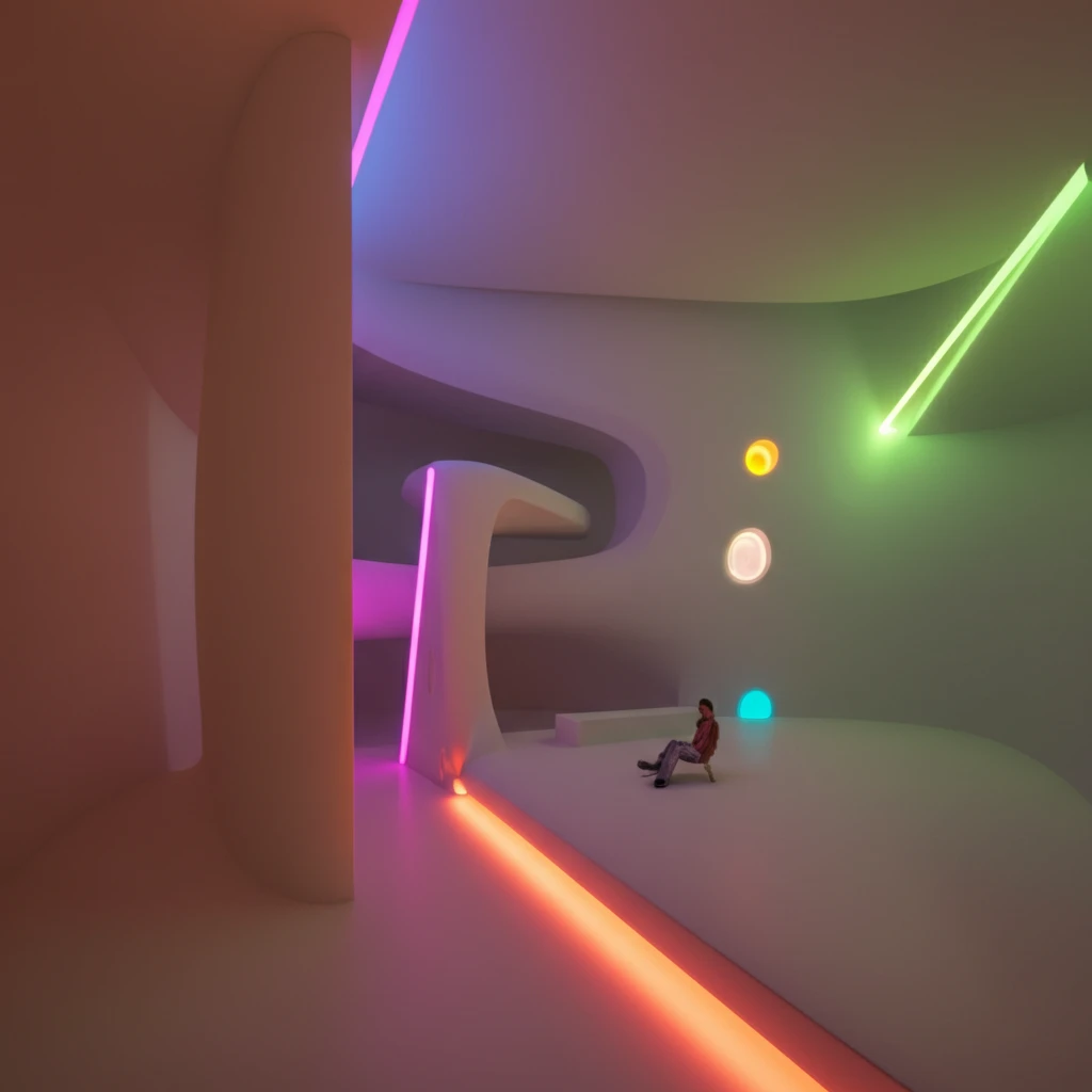
Decoding Color: How Unique Hue Perceptions Shape Design and Our Understanding of Light
"Dive into how saturated and desaturated colors impact our perception of unique hues under different lighting, influencing everything from interior design to digital displays."
Color is more than just a visual sensation; it's a fundamental aspect of how we perceive the world around us. From the clothes we wear to the environments we inhabit, color influences our moods, decisions, and overall experiences. The concept of 'unique hues' – those pure, primary colors that seem to exist without a trace of other colors – has intrigued scientists and artists for centuries.
Imagine a red so pure it contains no hint of yellow or blue, or a green that is neither yellowish nor bluish. These are unique hues, and understanding how we perceive them is crucial for various applications, from developing accurate color appearance models to creating visually harmonious designs. Historically, researchers have explored unique hues using highly saturated colors under standard lighting conditions. However, recent studies are delving deeper into how desaturated colors and varying light sources affect our hue perception.
This exploration is essential because the colors we encounter daily are rarely perfectly saturated, and the light illuminating them is seldom 'standard'. Think of the subtle pastels in a calming bedroom or the warm, muted tones of a sunset. To truly understand color, we need to consider the interplay between saturation, lighting, and our individual perception.
How Does Light Affect the Colors We See?

Light dramatically changes how we see color. The color of an object isn't just a property of the object itself; it's a result of how that object interacts with light. Different light sources have different spectral power distributions (SPDs), meaning they emit varying amounts of light at different wavelengths. This affects the colors that are reflected back to our eyes, and thus, how we perceive them.
- Correlated Color Temperature (CCT): Measured in Kelvin (K), CCT describes the 'warmth' or 'coolness' of a light source. Lower CCTs (e.g., 2700K) appear warmer (yellowish), while higher CCTs (e.g., 6500K) appear cooler (bluish).
- Duv: This value represents the distance of a light source's chromaticity from the Planckian locus (blackbody locus) on a chromaticity diagram. It indicates the tint of the light – whether it leans towards green or magenta.
- Munsell Color System: A system that specifies colors based on three color dimensions: hue, value (lightness), and chroma (color purity).
What Does This Mean for Design and Technology?
These findings have significant implications for various fields. For designers, understanding how light and saturation affect color perception is crucial for creating visually appealing and functional spaces. Whether it's choosing the right paint colors for a room or designing a user interface for a digital device, the interplay between light and color can greatly impact the user experience. For technologists, this research highlights the need for more accurate color appearance models that can account for the complexities of human vision. Models like CIECAM02 are constantly being refined, and studies like this provide valuable data for improving their accuracy and predictive power. Ultimately, a deeper understanding of color perception will lead to better designs, more realistic displays, and a more visually harmonious world.
